
My approach to Fully integrating design TEAMS into Agile Organizations
SCOPE
As a UX strategist and design ops manager at SmartPharma I developed a change management approach for fully integrating our design organization with the Agile scrum teams and trains. Throughout my 14 year career I have developed teaching tools and principles to help designers, product owners, engineers and other key stakeholders quickly grasp concepts and integrate design organizations with cross-functional Agile teams. Here I share some of the methodologies and outcomes implementing my triple track agile process at a life sciences startup.
Fully integrating design teams with Agile organizations can be a real challenge. I leverage a combination of Design Thinking, Lean UX, Agile and operations design methodologies, and collaborate with my teams to create a gated design process that gives all parties more of what they want and less of what they hate. When we implemented this new system our design team reduced the time to delivery by almost 50%, dramatically increasing velocity and significantly improving the health of the backlog.
Contribution
Introduced a design operations approach and tailored the methodology and messaging to serve the organization, collaborating closely with our VPs of Software and Product, Agile leadership and design teams.
Led process elaboration workshops to co-create a solution that serves everyone’s needs and solves existing pain points.
Tailored a gated design methodology to the existing AgileSafe system that enables product to take ownership of Epic/Feature hypotheses, reduce rework and dramatically increase velocity.
Guided cross functional teams through PI planning exercises with the larger product organization to clearly delineate decision points, owners, validation approach and enabling ceremonies.

Analysis
The design team had been struggling to integrate into an AgileSafe environment for years, and were considered a pain point in the development process due to long research and design lead times which were difficult to control.
Design team functional areas included UX architects, product designers, human factors engineers, creative director, UX copywriter, visual designers and design technologists. It was critical to our success that the design team collaboratively create a simple process that enabled all participants to orient themselves to the current status and deliverables at any point in time.
The product owners and managers spanned a variety of capabilities, from product leadership to project management sometimes bordering on scrum master. Unfortunately the product organization had bee unable to rally a disciplined approach to hypothesis framing, which led to confusion around requirements, acceptance criteria and even QA.
Engineering was frustrated with the impact to backlog and the low confidence in timelines, and eager for leadership that would tightly integrate the design processes with Agile sprints and product increments.
Design Solution
My user-centered design operations method
Smart and fast product development through hypothesis driven designs, iteratively validated solutions, no big upfront design, and continuous learning loops.
Meets engineers where they are & merges an Agile process with the best of Design Thinking & Lean UX.
Increases velocity by getting buy-in from senior leadership and team to enable quick pivots and reduced rework & scope creep.
I implemented gated design process In order to bring the teams and stakeholders quickly into alignment at critical junctions in development. This enabled the team to clearly define how to get into and out of design phases. The gates ensured that our cross-functional teams to quickly clarify epic and feature hypotheses tied directly to business objectives and OKRs. Each sprint included two one-week design loops, enabling rapid level-setting, iteration and validation every week.
And I’m always there in the mix, keeping things moving by
continuously advocating for a user-centered design process that creates a direct listening and learning channel to the people we serve
supporting strategic business exploration with research and user-centered methodologies to increase confidence levels in roadmaps and products
finding bottlenecks and owners and empowering teams by synthesizing and sharing knowledge
collaborating with Agile coaches and engineering leadership to optimize processes
democratizing design by exploring root causes and collaboratively innovating with stakeholders
mentoring product, engineering and design teammates to facilitate problem solving and scheduling
developing trust with my coworkers by observing their strengths, celebrating their contributions, and finding ways to utilize their unique skills and interests
applying UX principles to our own design processes by listening to my teams and identifying pain points so that working together is also a delightful “user experience”

Integrating design & Agile
In the Discovery phase, UX is focused on understanding just enough to define the epic hypothesis. Until a sufficiently detailed epic or feature hypothesis has been defined, product design does not start. UX Architects and Human Factors Engineers may contribute foundational research to orient teams to the user and context, as well as clarifying business opportunities and impact to platform architecture. Product owns the gate, and utilizes a RACI model, identifying and assembling the stakeholders who will participate in defining the requirements and validation approach. The product owner also defines the risk level, which informs the level of human factors testing needed for that particular feature.
In the Design phase, product designers immediately begin a rapid learning loop supported by Product and UX design ops.
Learn
Each week the cross-functional teams meet in a LEARN ceremony to align on the current status and determine if the design has met the acceptance criteria defined in the epic hypothesis. If another design cycle is necessary, the epic hypothesis is updated as needed and the team aligns on how they will validate the next set of designs with users. I’m there coaching the team to articulate their logic clearly and frame a testable hypothesis with a resourced validation method.
Build
The designers get TWO FULL DAYS (Without meetings. Really.) of heads down time, leveraging the design ops manager (me) for design thinking collaboration and chasing down answers from other stakeholders. If the designers need information, design thinking support, rewarding snacks - I’m there to help and support.
Measure
Because finding the right users to validate design is is often a bottleneck when implementing Lean UX, it is key that Product owns the solution for user validation since they are the only stakeholders who have the power to acquire the resources.
User validation is critical to this approach, and prevents opinion based spin in the design process. Product owners must fully support user validation to provide directional guidance for business decisions. They are responsible for aligning with the team on the validation method, number of users participating, and the allocation for a researcher to run the studies. (User validation is a meaty topic, but at the core it is entirely focused on increasing the confidence in design decisions through quantitative & qualitative evidence. In this regulated environment the validation process was more rigorous than a straightforward consumer market.)
On Friday the product designer makes updates to the designs as needed in preparation for sharing with the larger team in the LEARN ceremony the following week.
When the team meets on Monday they determine if the current design satisfies the acceptance criteria. If the design still requires iteration, then the product owner updates the epic hypothesis if any new requirements have been uncovered and secures the resources to support the user validation needed for the next cycle.
If the design is accepted it moves into the delivery track and is ready to spec.
In the Delivery phase, the product designer specs the designs and supports the development team with paired design/dev as needed. When the designs are ready to demo, UX conducts a design QA gate to determine if the software has been built to spec. Human factors may conduct summative studies depending on the risk level and complexity of the feature or epic.
Our story
It took about 6 months to implement this approach. By my second product increment planning session my teams had fully adopted the concepts and were pushing back when stakeholders asked them to depart from the process.
The payoff was immediate. Design timelines were reduced by almost 40%.
Product owners took control of the gates, supported and enabled by UX and engineering. Collaborating with the trains and stakeholders, they became the champions for design thinking and gated Lean UX cycles of Learn/Build/Measure.
Engineering teams loved the clarity of handoff and the higher confidence levels in the backlog health. The shared language of Agile & operations design principles resonated with their prior professional experiences, enabling us to quickly align on terms and approach.

Designers found that they had higher confidence and much shorter design cycles due to the new clarity around requirements and acceptance criteria. They also were involved early and often in the discovery and requirements gathering phase, collaboratively developing concepts to support a deeper understanding of the challenge within the entire team. Being involved from the beginning increased their confidence in the designs they created, and enabled them to move quickly from concepting to fully fleshed out designs. They also became more relaxed in their work as they saw that the iterative approach allowed them to worry less and design more.

My favorite moment in this experience was after our first PI planning, when a product designer working on my team Slacked me to tell me that she was so excited to be working on my project, and had never felt so safe as a designer.
In her words, “You da 👑.”
That’s the power of Agile integrated-design operations.
"I love working with you. I’ve never felt so safe."
- Product Designer
"This is the most beautiful agile ux process i’ve ever seen."
- Scrum Coach
“You’re one of my favorite people.”
- Sr. VP of Software
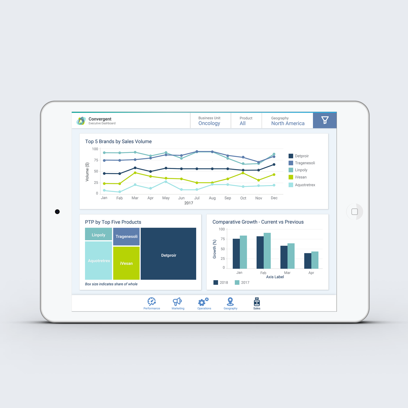
Convergent
Executive Pharmaceutical Dashboard
SCOPE
A top 10 global pharmaceutical company required a business intelligence dashboard for their executive team. The current dashboard was a year old, and did not reflect new products or changes in the organizational structure.
Additionally, the organization recently shifted to a new business intelligence tool, making it necessary to completely redesign the function, layout, and content of the executive dashboard. The client also required a design library of dashboard and data visualization elements that could be implemented in future dashboards.
Contribution
I served as the lead UX designer on a cross functional team of developers, business analysts, project managers and client product managers.
I was responsible for managing delivery of all UX activities in step with the overall project timeline, including research, workshops, wireframes, prototypes, full design mocks and a branded design library for wider organizational use.
I was also responsible for coordinating with tech and business to ensure alignment throughout the project life cycle.


Analysis
The users were a group of 8 executives at the highest level of hierarchy in the organization, between the ages of 38-63, all but one with with advanced degrees. The dashboard needed to serve a wide range of users with varying levels of technical expertise.
Users expressed dissatisfaction in the current tool due to the dated interface, difficult interactions, excessive load times, inability to easily correct errors, and cluttered contents.
Due to the evolution of the current dashboard, the information architecture was unclear to users and required "back and forth" navigation to answer questions.
Users primarily reviewed reporting on a tablet device while in meetings and on the road. Laptops were preferred for deeper analysis at the user's desk. None of the users expressed a need for a mobile solution.
The existing dashboard had accreted redundant and low-value metrics over several years that cluttered the dashboard and impacted usability and comprehension; metrics were not selected to answer specific questions, but rather thrown in "just in case."
Design Solution
Updated information architecture to more accurately reflect user mental models
Reduced KPIs and data visualizations to the bare essentials to minimize noise and support actionable insights\
Optimized dashboard design and images to reduce the load time common with business intelligence tools managing large datasets
Designed and implemented modern design library of interactions and data visualizations for tablet and desktop that support users over 55 with large type, easy interaction targets, and color-blind tested for ease of use


UX Design Cycle
APproach
I used a user-centered design cycle in a project-based consulting environment. Rather than continuous development, we had limited opportunities to update the executive dashboard annually with minor updates throughout the year. Within those sprints we practice a user-centered approach, beginning with user research, iterating through design/test cycles, and finally moving to build after sign-off from the client team.

Plan
The project kicked off with a scoping workshop that established the parameters of the dashboard, the business assumptions, users, and high-level sizing activities. A critical path was established working backwards from the delivery date and estimating necessary design activities. Regular workshops were scheduled with the full cross-functional team and a representative group of users from the client to establish a working cadence.
Research
A combination of primary and secondary research enabled us to move quickly into rapid cycles of design hypotheses and testing with users. I reviewed existing solutions from the last few years, coordinating with business analysts to deepen my understanding of the underlying data and jobs to be done. Users were interviewed to understand jobs to be done, context of use, and questions to be answered. Personas were developed with feedback from users as well as business analysts and client product owners.


Design & Test, Repeat
Remote and in-person collaborative workshops and white boarding sessions were conducted with stakeholders and users to create a first draft of the dashboard. Every data element was explored and validated to ensure that the underlying data was available, represented accurately, and visualized in a meaningful, actionable way.
The whiteboard sketches became the foundation for more granular grey-scale wireframe prototypes to narrow the focus to the content and layout of the data elements and visualizations. The designs were validated with business analysts and project managers, then tested with users for ease of use and data comprehension. User interviews supplemented test findings to refine our understanding. The designs were revised based on the feedback provided, followed by further rapid cycles of user testing and interviews until the design satisfied all requirements and was approved by the core team.
The final prototype was converted to a full-color mock, tested for usability and accessibility, and validated one final time with the client. The final client-approved version was shared with the development team along with detailed specs and all visual assets.

Build
Once build began I remained closely engaged with tech and business to ensure that all designs were built to specifications, and that any outstanding questions were addressed quickly with rapid design and user validation.
While the dev team focused on the build, I created a branded library of core dashboard UI and data visualization elements that would serve as the new visual language for business intelligence in the organization going forward. The design library was also developed with rapid design/validate cycles with the core team and then with users.
Deliver
The dashboard and design library were delivered to the client and implemented with users, who were trained on the new BI tool and dashboard. After the dashboard was live and had been used for several few weeks, we checked in with the product team and users to understand any pain points and make modifications as needed using the same rapid design/validate cycles introduced in the initial project approach.
After delivery, minor modifications were made quarterly to reflect small organizational shifts. The dashboard and design library were revised annually to update reporting content and incorporate new interaction and data visualization elements as needed.
"I've never had so much fun developing our annual performance dashboard."
- User Feedback

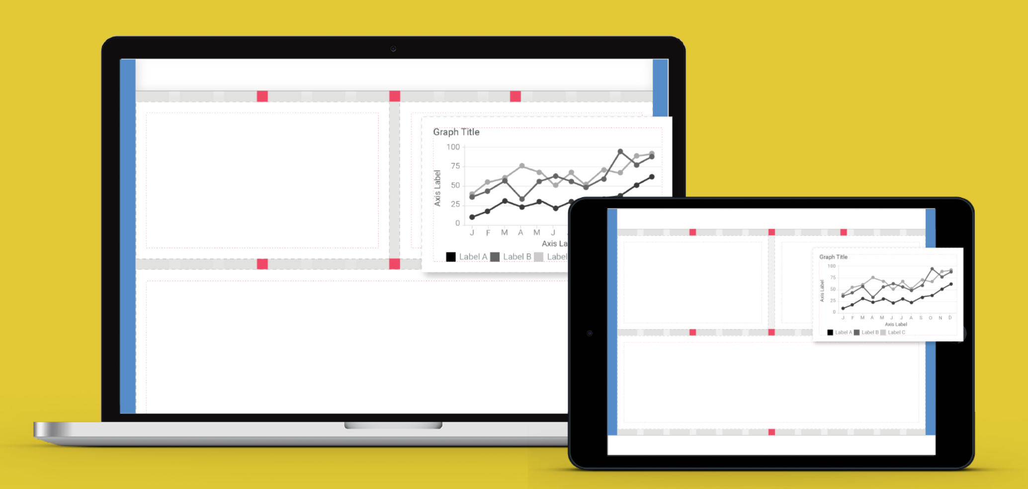
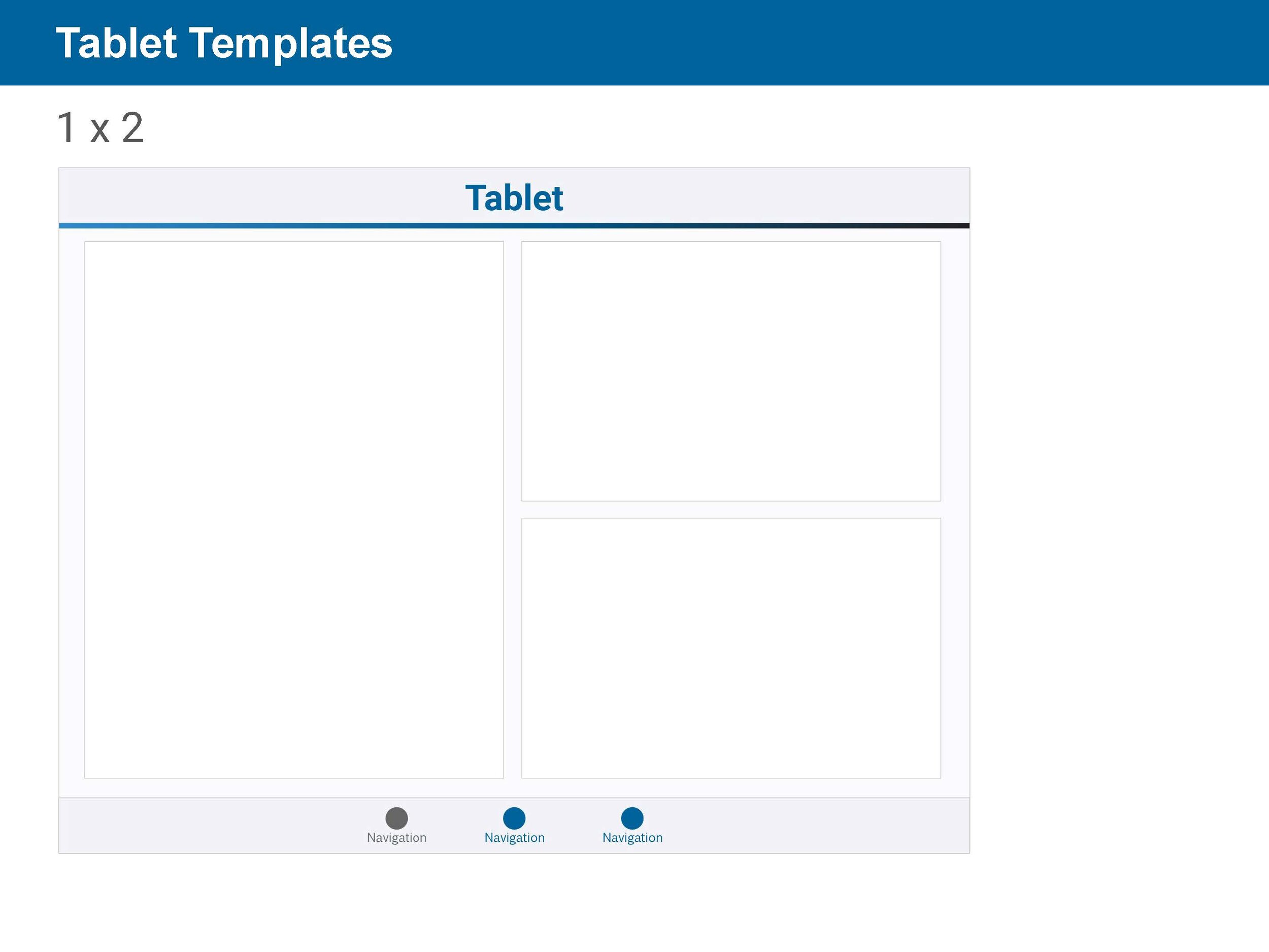
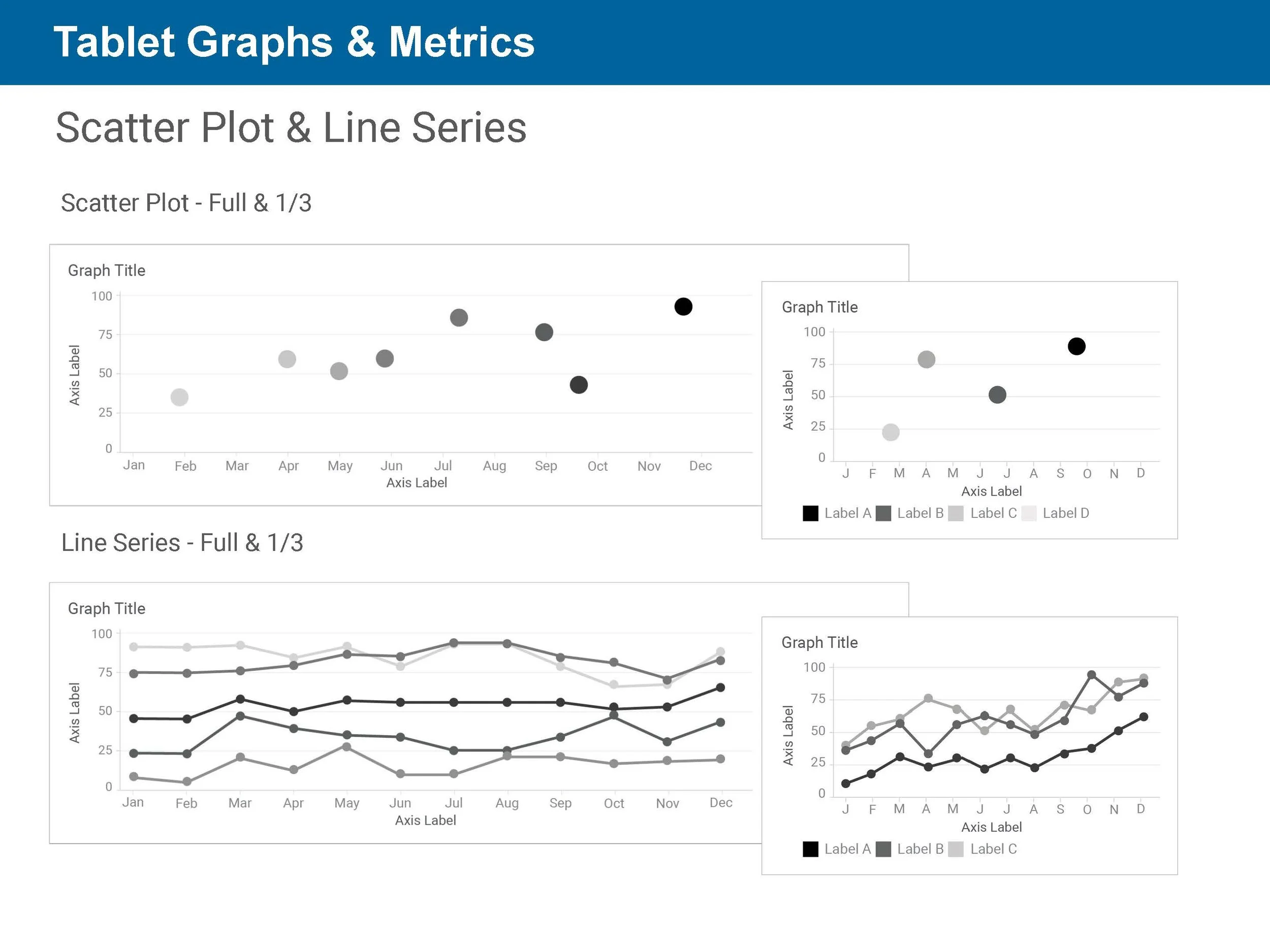
Flexible Dashboard Design System for Tablet & DEsktop
Process & checklists, Data visualization & UI element library


SCOPE
Our consulting company required a set of reusable components that could be implemented in a variety of design & office suite tools for a wide range of users. Our goal was to create a set of reusable components that could be used to quickly scale our solutions for clients and provide higher quality data communication across all teams in the organization. The system would be user friendly, support limited sight with color-blind safe palettes, and be white labeled for our clients who required fully custom solutions. Most important, the system could not be overbuilt or indulge in complexity: the minimum viable product would be delivered as slide deck so that literally anyone could use it.
Contribution
I served as the UX designer and primary manager for the project, conducting all workshops, research and design iterations. I collaborated with our entire UX team to collect best practices and conduct critiques of the designs. The designs were informed over the course of 18 months by regular client work which informed our understanding the future design needs. At the end of the project I delivered 2 identical sets of editable power point & Illustrator templates for tablet and desktop dashboards.


Analysis
The consulting organization required a dashboard design system that would enable non-designers to communicate clearly with clients and create successful dashboards that could be evolved with a design expert when necessary.
The UX team needed reusable components that would enable them to quickly consistently delivery high quality and usable dashboard designs. The templates would need to be agnostic enough that they could be imported into a variety of contexts and software systems and still fit together seamlessly.
Design Solution
Branding incorporated modern sans serif fonts & a vibrant yet muted palette consistent with the organization style guide.
User friendly fonts and validated data visualizations are all color blind tested and compliant with iOS developer standards and can be implemented in a material design framework.
Plug-n-play components in a “go anywhere” power point made ideation and collaboration with business analysts three times as efficient compared to previous design processes.
Data visualizations were optimized and tested with clients over 18 months to identify highest value elements to include in the sets.
The entire suite of designs were created in Illustrator and then ported into Axure, Figma and Google Slides for ease of use and access.

A1C Tracker
Pharma Agency A1C Proposal


SCOPE
The brand team for a major pharmaceutical company requested a pitch for their combined site that would establish BI as a digital innovator in diabetes oral medications.
This team was recovering from an investment in a diabetes social networking portal that failed because very few patients used the site. This made them incredibly risk-averse, so big plays were out of the question: economy was vital.
The client was very attached to a sign metaphor which had been used in the existing site and wanted to see this imagery incorporated in the concept and design.
Contribution
I served as the lead UX designer on this project, managing a graphic designer: research, analysis & creative direction.


Analysis
Research has demonstrated repeatedly that patient engagement is key for successful diabetes intervention. The rising prevalence (and dropping cost) of activity trackers creates an opportunity for engagement between HCPs and patients to support optimal patient outcomes. The opportunity to engage the patient with their health in a way that allowed them to demonstrate their efforts and get credit for the changes they were making.
This approach was consistent with research we found indicating that while patients who are overweight or manage diabetes tend to be more accurate in their reporting of activity and consumption than the general population, and that they are often frustrated and emotional when they are not believed, which erodes trust in the primary care provider and can negatively impact outcomes. Our goal was to strengthen the relationship between the patient and the HCP by facilitating data sharing and treatment adherence.
Design Solution
Weaving the patient personae through the HCP and patient sites created an opportunity for conversations between users and care providers which supported therapy consideration
We created patient personas that spoke to specific brand differentiators, with deep links to research findings to support therapy claims. This enabled patients to identify the persona that most reflected their experience, and use that as a conversation starter with their HCP.
Integration with fitness trackers enabled patients to monitor impact of diet and exercise on A1C levels and share data with care providers. We received very positive feedback from the client on this approach, which they ultimately included in their brand approach for this launch.

SmartNanny
Baby tracker and virtual assistant with NLP bot & IoT integration


SCOPE
A small startup client hired me to conduct a Lean UX sprint with their product and dev team to explore innovation opportunities in IoT apps.
We conducted a speedy 1 week sprint, beginning with an assumptions workshop where we articulated current assumptions about the IoT market, developed hypotheses and created proto-personas for our potential users. Next we conducted a collaborative design workshop where we drew sketches together as a team and articulated the MVP for this sprint. We tested two days later with users recruited and screened via social media. Following our workshops we repeated the assumptions workshop to explore future opportunities and prepare the team for future sprints. We also conducted a retrospective analyzing opportunities for improvement in the UX sprint process.
The team settled on a baby tracker app that provided cross-platform data analysis and monitoring for IoT baby monitors, telehealth providers, and EHRs.
Contribution
I served as the UX designer and conducted all workshops with product and dev, as well as designing a high-resolution prototype for concept testing with users, conducting research, and analyzing findings with the team.

Analysis
Smart Nanny's target demographic is a tech-savvy parent, caregiver or healthcare provider between the ages of 28-45 that needs to
monitor the growth, development and health indicators of a baby or child during and after pregnancy
automatically import feeds from a variety of data sources to create a comprehensive picture of my baby’s health
share information with other care providers
easily access medical information and guidance
Design Solution
Branding incorporated modern sans serif fonts & a vibrant, gender-neutral palette of complimentary tints, invoking a bright and cheerful modern environment
Large fonts and streamlined data visualizations tell clear data stories with progressively detailed data relationships
Intuitive interfaces leveraged common interactions for managing data sources and user permissions
Bot-based triage into medical care reduced barriers to professional guidance


Key Features

Alert users to key risk factors, events or data updates
Monitor daily key performance indicators
Track new event with timers
Drill down view of tracker performance
Capture key moments and health indicators with photo or video
Draw and annotate images or videos
Tag images and videos and connect with names, data categories and other unique identifiers
Share content with users and social media

Pure Good
Food-grade skin care company


SCOPE
Pure Good Skin Food, a vegan, food-grade skin care company, required UX design for products, packaging, print & digital assets.
Products and assets were developed collaboratively using Agile methods to partner with a small team of formulary experts. This cross-functional team worked together to optimize the product for efficient manufacturing, reduced environmental impact & ease of use for consumers.
Contribution
I served as the lead designer on all Pure Good assets - product development, branding, POS and DTC packaging, print materials, digital assets, marketing assets and sales experience.

Analysis
Pure Good’s target demographic is a conscientious consumer who will pay more for thoughtful, minimalist design that supports the value proposition (vegan, eco-friendly, food-grade fresh, micro-batch)
Consumer must be educated on why the product works and how to use it, as the system is unusual compared to mass-produced skin care systems
Packaging simple & efficient to reduce manufacturing costs, environmental impact, & provide an intuitive user experience for the entire customer relationship
Purchase path must minimize barriers for registrants & surface relevant products
Design Solution
Branding incorporated modern sans serif fonts & a limited palette of green and grey tones, invoking modernity, environmental responsibility, and artisanal manufacturing
Product packaging, print and digital instructions were iteratively developed using user research and rapid prototyping to efficiently educate and inform
Digital experience, particularly purchase paths, were optimized for minimal interactions & exposure to relevant content


Branding & Style Guide
Thoughtful, minimalist design supports Pure Good’s core value proposition. A limited palette emphasizing black and white designs with plentiful white space invokes modernity, environmental responsibility, and artisanal manufacturing.

Product and Package design
Beyond communicating the brand values aesthetically, eco-friendly packaging and manufacturing process were key to the integrity of the product.
Numerous iterations of product packaging designs allowed for a flexible approach to product development and brand evolution. Efficiency was the guiding principle at every stage of the research and development process.
To reduce waste and the cost of shipping, the Daily Face skin care set is sold with a set of branded, reusable bottles & refills are shipped in heat sealed packets. One-color printing leveraging standard print sizes reduced costs and assembly time. Each refill package is personalized with the recipient’s name to emphasize the artisanal, personal quality of the brand experience.
"My skin has never felt like this."
- User Feedback


"All these tiny pimples disappeared within a week."
= User feedback
Educating the Consumer
The oil wash process in Pure Good’s Daily Face skin care set is unusual in the skin care market. Research revealed that users were unclear how to use the oil wash, and had anxiety about “doing it wrong”.
The infographic was created as a full and one color print to create a unified educational experience and prime the customer’s expectations regarding the product.
A friendly illustrative style was used to increase the users’ comfort and reduce anxiety around the product use.
"My skin can breath!"
- User feedback

